Finally Frida!
The Art Gallery of Toronto is bringing Frida Kahlo and Diego Rivera to Canada for the first time in an exhibit called ‘Frida & Diego: Passion, Politics and Painting.’ This event has been on my iCalendar since it was announced so ‘anticipation’ would be the word that first comes to mind.
I will be at the Members’ Preview so please watch this space.
Quirky and humourous: Dutch product design at its best

Lamps by Moooi Amsterdam

Chest of drawers by Tajo Remy
When I think of Dutch culture, I think of art and design.
On my last visit to the Netherlands, I had the chance to go beyond Amsterdam and to see the lovely little cities surrounding the capital. What unites the seven cities and towns I visited is the function that the architecture and design that is inherent in everyday living. Everything makes sense.
The porcelains of Delft, the houseboats on the canals and giant bay windows are indicative of the pursuit of purpose without sacrificing aesthetics. And why not? The stereotypical coldness associated with the geography is broken when you step back to realize the romance of the whole picture.
Filed under Architecture, art, City Life, Industrial Design, Interior Design, lifestyle, travel, Uncategorized
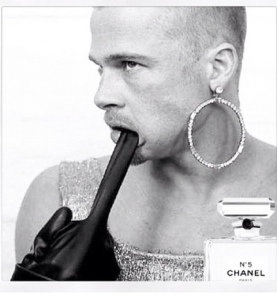
Brad Pitt for Chanel: What do you think?
So I hear that Brad Pitt is the new face of Chanel No. 5 and the iconic scent’s first male spokesperson. A question comes to mind: if the epitome of Eurocentric/American masculinity is used as a medium to question gender norms and conventions, is he biting the hand that feeds him? More importantly, did Mrs. Jolie-Pitt have a hand in convincing him?
Filed under fashion, ideas, lifestyle, Photography
We’re on Pinterest!
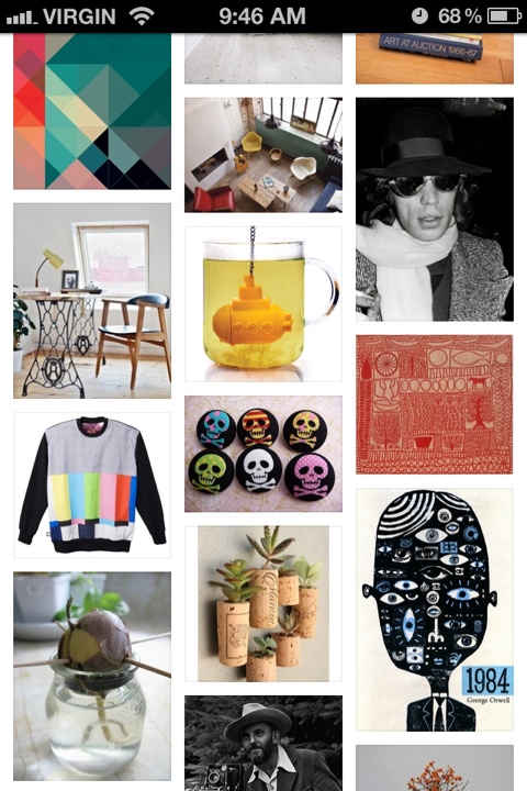
For those who are on Pinterest, Urban Peanut: A Gallery has a board! Come and check it out here.
Filed under Architecture, art, City Life, fashion, graphic design, ideas, Industrial Design, Interior Design, lifestyle, Uncategorized
On cartography
Directions are either helpful or confusing, maps included. Visual cues are meant to minimize interference by by language and this is where design comes in. Conventions and cultural references are used to help in this experience but there are still shortcomings.
The visual that a map presents to its beholder is spatial; ingenious use of other elements like colours and texture gives the said beholder a space for personalizing the experience of wayfinding. One good example of this visual map is the ‘You Are Here’ map that can be found at any shopping centre. By using the beholder’s relative starting point, the hunt for the shoe sale is a little closer for someone shopping with daddy’s credit card which is a blessing (for the current teenager) and a curse (for the same teenager but ten years from and now also for the unknowing father).
Maps are documents of discovery. Without blazing trails, maps would not exist and without verifying accuracy, maps could very well be drawings mazes that can be filled with colour using wax crayons. Navigators commissioned by kings earned a living heading to the unknown seas brought back trophies as well as roughly plotted maps of their routes to get from one place to their destinations. Christopher Columbus had an estimated idea of how to get to the New World but confusion about where exactly his ship landed has born a huge influence on our present geographic references.
Recently, experimentation in cartography has come from graphic design. The maps are neither topographic, geographic or political; they have become typographic. Looking at the Ork maps of cities, including Toronto, the intention is to visually represent the different neighbourhoods and districts in urban centres through kerning and letting. They are useless if you are a tourist trying to navigate the streets but heck, they are beautiful.
Present-day collectible maps are great to serve as art and design pieces. Nothing else. They are visual references and approximations that could be slightly helpful. One can argue that this is a design failure; another can rebut by asking if we even need maps still. The analog/puritan in me would say ‘yes.’ The tech enthusiast in me asks, ‘don’t I have an app for that?’.
Filed under art, City Life, graphic design, History, ideas, Uncategorized
Of guppies and yuppies; or Cities, Vertically Speaking
Life in cosmopolitan presents complications that can easily be resolved or not. Aging infrastructure and limited finances leave citizens distraught. Urban sprawl has motivated architects and designers to find ways to alleviate the stresses that affect city-dwellers. The best example is condominium development.
The vertical growth of a city centre can be used as a measure of economic growth and development. However, when a boom in development ensues, it has been observed that a recession takes place upon these projects’ completion. Dubai’s Burj Khalifa comes to mind from recent history.
On a much smaller scale, stacked settlements like condominiums have inspired industrial designers like Teddy Luong. His FishHotel for Umbra is an ingenius piece of design that applies the concept of space conservation. Traditional fish tanks and bowls have been points of interest in a space. (Feng shui states that a fish tank is a means to attract wealth and abundance.)
With its design, stacked FishHotels are a refreshing way to play with a space. I can see a wall of different coloured Siamese fighting fish. I think they’re going to be big this year.
Filed under Uncategorized
Reimagining Mickey’s Mouse Ears
 Visual communication is inescapable and we have accepted this situation. Ads are part of the visual clutter that encompasses urban living and brands are looking for a piece of the most important real estate there is: your brain.
Some of the brands that have made their imprints run the challenge of reinventing themselves to stay relevant, to widen their reach and to remind people how great their childhoods were because of this one particular brand.
Disney today release a new Joy Division inspired version of Mickey Mouse’s ears for the band’s Unknown Pleasures from 1979, designed by Ian Saville. With this logo, a new generation of Disney fans witness a reinvention of the popular mouse-ears silhouette meanwhile arousing the nostalgia of those who are, ahem, mature enough to know, recognize and appreciate record art. I will be ordering one because for the mouse ears.
Of Pantone and panettone
Confusing Pantone for a baked good is a mistake that can easily be forgiven, if not by your waistline. Indulging in colour is a paralyzing fear that can easily be overcome with effort and patience. After all, not everyone is going to look good in 2012’s Pantone of the year: 17-1463 Tangerine Tango.
Orange coaxes feelings of happy mornings and as well as a ride through Spain in late summer when the orange trees are in bloom from Valencia to Madrid. It’s a particular colour — only the bold dare to wear an orange angora sweater or invest in an orange Lamborghini. It is a difficult hue but leave it to the experienced to teach us mere mortals a lesson. Is it the new red?
Filed under Architecture, art, City Life, fashion, ideas, Industrial Design, Interior Design, lifestyle
Urban Peanut: A Gallery Holiday Design Gift Guide to Me
December has slapped us in the face with no apology. Being cooped up in a suburban box for most of my waking hours should not be an excuse for the lack of action on ‘the Gallery.’ (I am quietly willing this nickname to get catchier every time I use it.)
With the season of gift-giving in our midst, a list is in order and better yet, a list of gifts that I would like to receive. They are the only gifts worth giving unless you prove me otherwise.
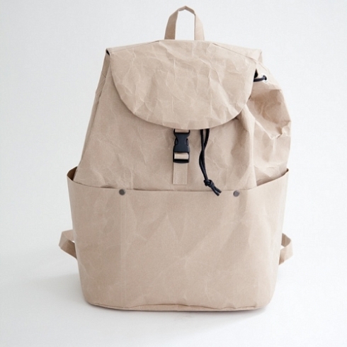
This SIWA Backpack by Naoto Fukasawa is made in Japan. The material is wash-suki paper which is quite deceiving because it is resilient, waterproof and become softer with the wear and tear of commuting. Ideal for the urban nomad in everyone. $250 at Mjölk.
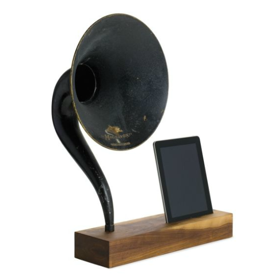
The iPad has been a game-changer since it was introduced to the market in 2010. Carrying one everywhere has been a constant for the person who is always on the go. Once you’re home, wouldn’t you like to have your sidekick come home to a nice cradle? I have been crushing on this iVictrola for iPad designed by Matt Richmond. It’s like the composite creature in Mary Shelley’s novel without the monster stigma. There is an old repurposed Magnavox horn from the 1920s to be used as the speaker with a handcarved walnut base. If you’re lucky enough to run into one, I know who has two thumbs and would like to find one under his tree. This guy. $985 from Design Within Reach.
Since it’s the holidays, we think about our friends and loved ones and how we can spend more quality time with them. It is all about being efficient with time and being always prepared for last-minute parties or dinners (maybe some that might have slipped one’s mind until about an hour before the appetizers). The Mini Cooper Coupé 2012 is a present that will keep on giving. Impromptu visits to the parents, aunts and uncles are on my list of resolutions. Please help make this possible. Starting at $25,950 at MINI.ca.

